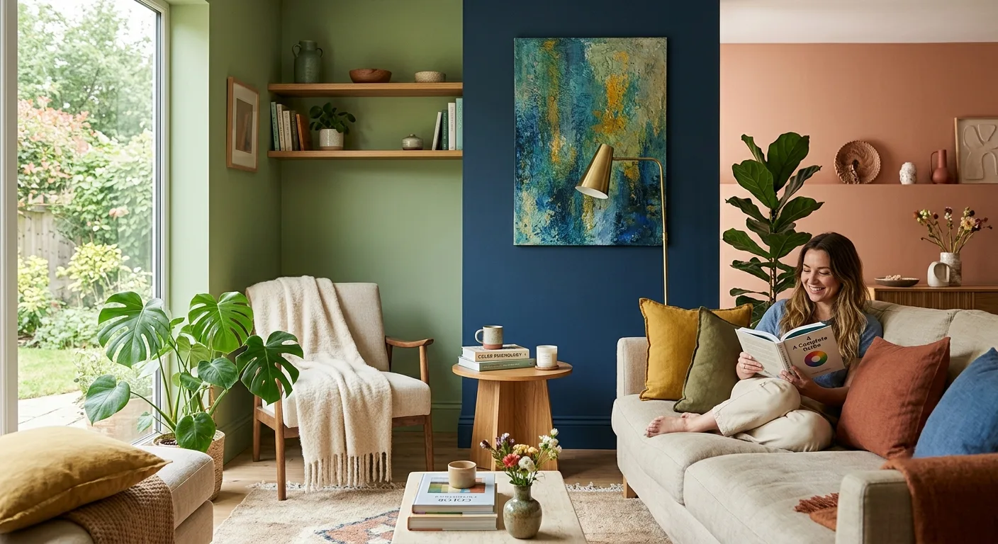
Walk into two rooms that have identical furniture but even slightly different colours on the walls. You will instantly notice that you experience two contrasting moods without even sitting anywhere. This is the psychology of room colours at play which is the subtle science of using colours to affect emotions and behaviour within the space. We at Design De Maison know this very well. Every one of our interior designs for Chandigarh, Mohali, Panchkula and the entire Tricity area are based on this very idea.
This guide takes an approach to colour psychology in interior design room-by-room, allowing you to select the best colours for home interior without making any guesses. If you are either working on creating an accent wall in one room, or have decided to renovate your whole home, knowing how colour affects you emotionally is the key to creating the perfect home space.
What Is Colour Psychology, Really?
Colour psychology refers to the discipline that seeks to explore how colour influences the emotions, perceptions, and biological functions of people. It has been proven that colour impacts our mood and the comfort levels of our study rooms. An article published by the journal Frontiers in Psychology analyzed 443 students residing in a university dormitory whose six similar buildings were painted in six unique interior colours.
The results of the study were surprising: a colour preference bias was detected for the particular colour in which the student lived; the lightness of the room was significantly influenced by the interior colour, and finally, blue interior colour is believed to contribute to studying activity. Additionally, Costa et al. identified a significant connection between having a calm mood and preferring blue (Frontiers in Psychology). Thus, we have an example of empirical evidence confirming that room colour psychology is far from being an architectural fiction.
Warm vs Cool Colours: The Science of Mood
With regard to colour psychology in rooms, all colours are placed under two main emotional groups.
Warm colours like red, orange yellow and warm browns are known to raise energy and also stimulate conversation. These colours are ideal for social areas where there is high activity but not suitable for areas where there should be relaxation.
Cool colours like blue, green, violet and pastel greys help reduce stress and increase the perception of space; thus, they are appropriate for small urban homes as well as large kothi rooms where more airy surroundings are required. In addition, designers also mention that the light and desaturated colours of blue and green appear more “expansive,” whereas the darker and saturated versions of the same colour create a cozier and confined atmosphere.
These neutral colours, which include white, beige, greige and light grey can serve as a blank canvas for the space. It allows the area to appear serene and less crowded and is an easy palette to work around with statement furnishings and accessories.
A Room-by-Room Colour Psychology Guide
Living Room
The living room is the place where colour psychology for homes comes into effect because it serves as the venue of tranquil afternoons and raucous evenings alike. It is the ideal combination of warm neutral colours, such as terracotta, mustard, and warm taupe, along with an accent wall that is deep green or brown. It works particularly well in Chandigarh Tricity kothi homes because of the height of the ceilings and windows.
Bedrooms
The best colours for bedroom design are calm and cool colours like soft blue, sage green, dusty lavender and grey. These colours help in slowing down one’s heart rate, hence providing a relaxed state of mind. It is recommended not to use red and orange in bedroom design since they are activators and can only be used for social areas.
Kitchen and Dining Zones
Kitchens are places that need colours that work to stimulate appetite and energy. All while those colours shouldn’t be causing you visual fatigue when you’re cooking for long. So it’s best that you go for soft yellows, warm white and muted terracotta which are some of the most popular choices. These feel fresh plus hygienic just as much as they are inviting. By contrast, you can pair it with warm wood tones with deep green for the dining areas. This is how you make an intimate setting for your family meals.
Home Office or Study
Choose cool blues and soft greens which are known to reduce fatigue. This is why they are so widley related to sustained focus which makes a strong choice for a home office or study nook. So this is a growing request among our Tricity clients who want to work from kothi based home offices. You should avoid overly bright colours which can cause you eyestrain.
Bathrooms
Go for light colours here like white, pale aqua soft sage. This keeps the bathrooms feeling more fresh and spacious. This is especially important for smaller en suite layouts which is where dark colours can make the room feel cramped.
Vastu and Colour: An Indian Design Layer
A lot of homeowners in Punjab and the Tricty region give importance to Vastu principles and colour psychology when they choose interior colours.
North facing rooms: This is where green is recommended which it is linked to growth and prosperity
East facing rooms: White is a preferred choice here which is the symbol of peace and purity. So this is perfect for living rooms and children’s rooms.
West facing rooms: Blue is recommended here for a calming and relaxing effect in the room
South west rooms: Brown and earthy tones are looked upto for rooms in this direction which is because of stability.
Vastu recommendations are very much in line with colour psychology:
- This is where cool tones promote rest and relaxation
- Earthy neutrals make a grounding effect
- Brighter colours suite active as well as energetic spaces
Designers use Vastu direction as a starting point before they apply colour psychology.
How to Choose Your Palette: Practical Tips
| Consideration | Recommendation |
| Room Function | Choose colours based on how you’re using a particular room. So keep in mind that your bedrooms should feel restful, living rooms inviting and studies letting you focus. |
| Lighting Conditions | Test the paint swatches first in both daylight as well as the evening light. This is important because colours can look different throughout the day. |
| Colour Balance | You have to limit the palette to one dominant colour. Then support neutral and one accent colour which is enough to maintain harmony. |
| Room Size & Ceiling Height | You can make a coxy atmosphere with darker shapes and high ceilinged rooms. But this can make smaller spaces feel confirmed. |
| Furniture & Décor | Make sure that the colours also compliment the furniture, flooring and decor elements. This is how you make a cohesive design scheme. |
| Lighting Fixtures | Then you finalise bulb temperatures and lighting fixtures before choosing any paint colours. This is because lighting very strongly affects the colour perception. |
Conclusion
Colour psychology in the field of interior designing is all about finding scientific correlation between the emotions associated with specific colours and their actual use within the room of your house. No matter whether it’s a complete renovation in a kothi of Chandigarh Tricity or redecorating one room, proper choice of colour, based on psychological knowledge as well as Vastu principles, can make your living space feel different every day. This is precisely what we do at Design De Maison.
Frequently Asked Questions
Q – What is the psychology of room colours?
A – It is the field of study concerned with the effects of varying colours of walls and interior decor on people’s mood, concentration, and behavior, using the well-documented effects that colours have on the mind and body.
Q – Which colour is best for a bedroom according to colour psychology?
A – Blue, sage and lavender shades are the most recommended as cooler colours. These bring calmness and help people sleep better.
Q – Are warm colours really energizing when it comes to room design?
A – Yes. Warm colours such as red, yellow, and orange bring a sense of stimulation and are recommended in social places such as living and dining rooms.
Q – Can colour psychology and Vastu Shastra be used together?
A – Yes. In many instances, colours suggested by Vastu Shastra like cool colours for bedrooms, earthy neutral colours for creating stability in certain rooms, and brighter colours for dynamic areas coincide perfectly with concepts of colour psychology.
Q – What would be the best colour choice for a study room/home office?
A – Cool shades of blue and green can work well for home offices since these colours have been linked with less eye strain and increased focus during prolonged periods of work.
 Home
Home Portfolio
 Call Us
 Whatsapp
 Contact Us
 Call Us
 Whatsapp