Color plays a big role in the interior design of spaces. It gives more than just an aesthetic appeal. Color is a powerful tool that can influence your mood. Your emotions can change based on the colors around you. Understanding the psychology behind color choices is important. It can help you create spaces according to your style.
This blog explores how color psychology shapes interior design choices. All the best for an effective design!
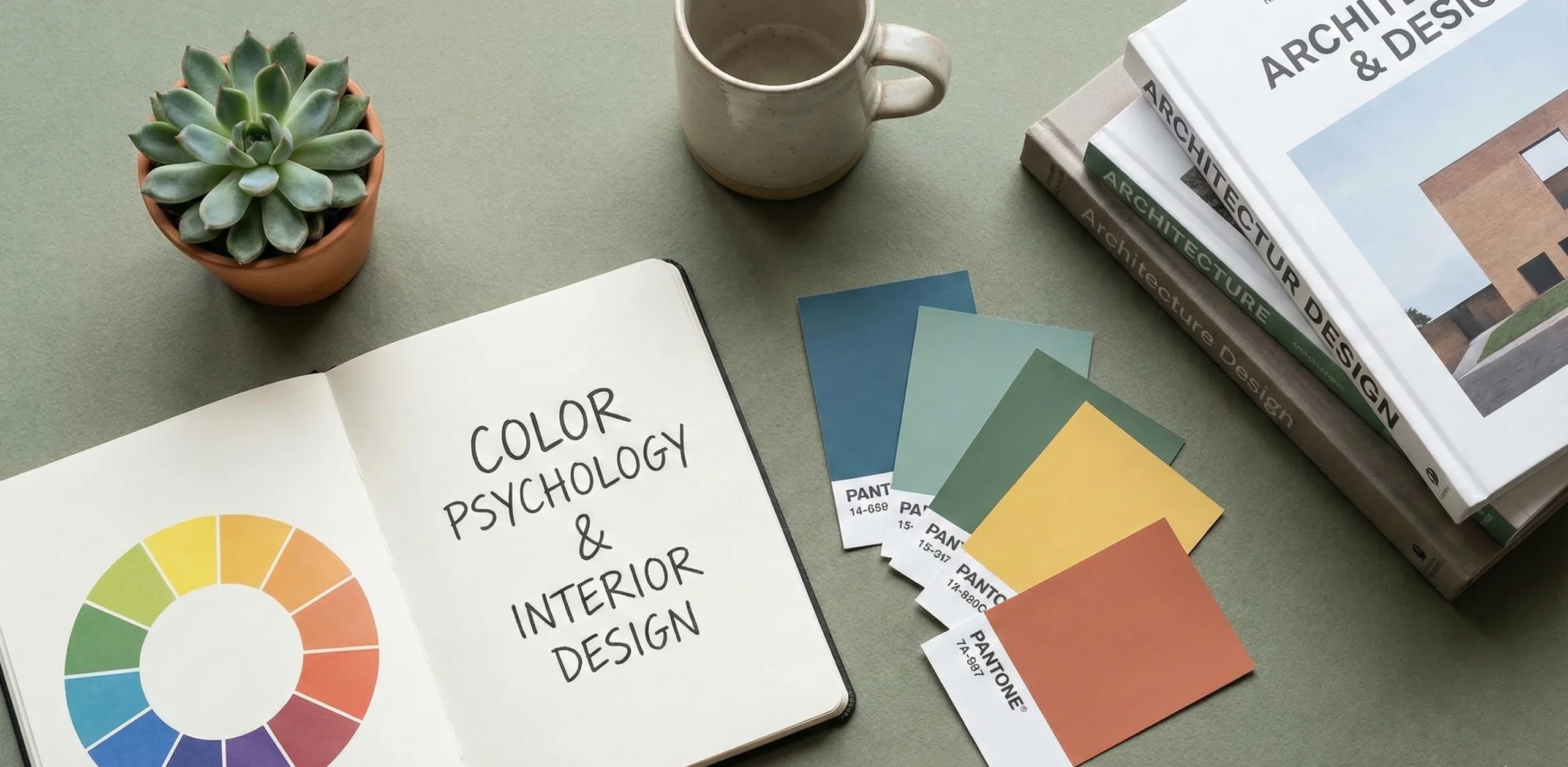
Stats & Research: How Color Influences Interior Design
Homeowners Believe Color Impacts Mood & Well-Being –
A research study found that 88% of people believe color affects their:
- Mood
- Emotions
- Overall well being
Color Is a Top Priority in Interior Design –
In the same study, 100% of participants believed that color is important in interior design. This is when designing or painting the interior spaces.
People Choose Different Colors for Different Rooms –
86% of respondents said they prefer different colors for different rooms. This shows a clear link between:
- Color choice
- Room functionality
Source: Research Gate
What Is Color Psychology?
Color psychology is the study of how colors affect human behaviour. The study is also about the impacted emotions. Hues can make people feel in different ways. It also influences our interaction with the space. Warm colours in spaces can make you feel more energetic. Cool colours do the opposite as they relax you. Color psychology matters for interior designers. They can enhance the functionality of your space.
What Are The Psychological Effects of Popular Interior Colors?
Colours can make you feel different emotions. Researchers have found that colours actually matter. They can also impact your psychological well being.
Blue:
Features of the color:
- Calm
- Serene
- Focused
This color is ideal for:
- Bedrooms
- Offices
Many studies show blue can make your stress levels go down. It can also improve your concentration in spaces.
Red:
Features of the color:
- Attention Grabbing
- Energetic
Red can be used to stimulate appetite. It is also a great colour for a good conversation.
This color is perfect for:
- Dining rooms
- Kitchen
Yellow:
Features of the color:
- Optimistic
- Cheerful
Yellow is a good color for some creativity in the space. It’s also perfect for a positive vibe in the interior.
The color is a great choice for:
- Kitchens
- Creative spaces
Green:
Associated with:
- Nature
- Balance
It is a relaxing color as it feels like nature. It can promote a sense of peace in your space.
The color can be used in these areas for calmness:
- Living rooms
- Bathrooms
Purple:
Used as a symbol for:
- Luxury
- Creativity
Purple can bring sophistication to these spaces:
- Home offices
- Bedrooms
Neutral Colors:
These are some of those popular neutral colors that work:
- White
- Gray
- Beige
Features of the color:
- Versatile
- Calming
This color is known for balance for accent walls. They can work as a backdrop as well.
How to Choose Colors Based on Functionality
Consider the mood you want to create with the colors. This is important to decide before getting your space designed. The room’s function actually matters here. Here’s how to select colors based on function:
Living Rooms:
Living rooms are where most of the socialization happens. So, choosing warm colors is the right choice here. Your guests can feel comfortable with these inviting colors:
- Soft oranges
- Reds
- Yellows
Bedrooms:
The main functions of a bedroom are these:
- Relaxation
- Aiding sleep
- Tranquility
Now, for that, you need these colors:
- Soft blues
- Greens
- Purples
Kitchens:
You actually need energy in the kitchen to be able to work. It is a high activity space that needs bright colors.
These colors can also increase appetite:
- Yellow
- Orange
Home Offices:
Productivity is the biggest need in home offices. You’d want to improve the focus with cool tones. Cool colors promote a calm work environment at home. These are the cool tones for your home office:
- Blue
- Green
Conclusion
Looking to choose the best colors for your interior? Colors actually have their own physiological impacts. It’s interesting how they can affect your mood and more. The colors of your environment make you feel.
FAQs
Q – Does color physiology affect interior design?
A – Color physiology changes the atmosphere of a space with color.
Q – Are there colors of psychology?
A – Yes, there are 4 colors of physiology. These include:
- Red
- Blue
- Yellow
- Green
Q – Which is the most attractive color in psychology?
A – Red is known as the most attractive color in psychology.
Q – How do colors affect mood in a home?
A – Each color promotes a certain mood. Blue can make you feel calm. Green is good for balance in the space. You can use yellow to boost happiness. Red is known to work the best for energy.
Q – Which colors are best for small spaces?
A – These light colors are the best for small spaces:
- White
- Cream
- Light grey
- Pastel
Q – What colors promote productivity in a home office?
A – You can try these colors with accents of yellow:
- Blue
- Green
Q – Can colors really make a room feel big?
A – Yes, lighter colors can make rooms feel larger. This is because they reflect light.


 Home
Home Portfolio
 Call Us
 Whatsapp
 Contact Us
 Call Us
 Whatsapp